Wednesday, 6 January 2016

Miss Georgiou - Rough cut


Audience feedback is very important for a production. This is as it allows for both positive and constructive comments to be made upon the work, so further changes can be made to improve the final version. This is why a rough cut is so essential to carry out, as if something in particular is said to be a serious flaw of the production for example, through the feedback given from viewers this can be changed, helping towards improving the final quality of the production.

We received feedback from our target audience via a number of different ways. The main one coming from the rough cut of the music video, which I uploaded to youtube, where people that watched it could leave comments on the production. As a group, we also showed the music video to classmates, friends and family, asking for any positive or constructive comments they could provide us with. Before publishing the rough cut onto youtube, as a class we showed each other everyones videos in little focus groups, where we got the chance to comment upon each others work.

This feedback benefited my production in a number of ways. It helped towards getting myself gaining a more up to date insight into what the target audience liked and disliked about the production, allowing for final amendments to be made before the release of the final version. With my group and I's production, since receiving feedback we have made a number of significant changes to the production which we believe will help towards making it more appealing for the target audience, which we wouldn't have even considered if any feedback wasn't given. Overall, I believe all the feedback my group and I have received has helped towards creating a better production, and one which is further suited towards the target audience we had in mind. As an industry as a whole, giving feedback to music video productions is important for this reason. A filmmakers objective will be to produce a video which is appealing towards their target audience, therefore receiving feedback from them and following this in theory should result in a happy audience and more popularity and sales, and improving the quality of music videos and what people want as a whole.

An example of one of the comments left on social media (youtube), on my group and I's rough cut

One positive comment we received was that the narrative was used well, and that number of different locations were present in the production. I think this was a fair comment to make, and that as I group we tried to incorporate a number of different locations which we deemed suitable for an indie music video and audience, to provide with a diverse viewing experience which we believed was done successfully.

Another positive comment my group and I received was that the portrayal of the artist was clearly evident, and that the position of struggle which he is shown as being in can be seen. I believe that my group and I did make this portrayal clear through the use of micro elements and the narrative, through the changing locations and the events which happen within the video, such as when the artist can't pay for the cab, signalling that he has reached rock bottom.

The next positive comment my group and I received was that throughout the music video, a large diversity of shots was used. Although the quality of the shots wasn't always great due to issues with the cameras focus, I do believe that the choice of shots throughout the music video were good, and helped towards showing the portrayal of the artist clearly, as well as providing with a diverse viewing experience which was engaging.

One constructive comment we received was that more filters could have been added, to make the music video look more professional and look similar to real media indie videos. I agree with this comment, and since posting the rough cut a number of changes have been made to the updated version, adding in various filters during the entirety of the video.

Another constructive comment we received on the rough cut was that some shots were filmed out of focus, and were blurry and unclear to see. My group and I appreciated this after looking back over raw footage when constructing the foundations of the music video, and is a very valid point. Going back to re film certain shots wasn't possible due to location restrictions (one example being as Liverpool street isn't close by), and as half of the shots were in focus and the other half weren't, we have worked around this and found a way to make the visuals more consistently clearer throughout the entirety of the music video.

The next constructive comment we received was that the role of certain characters and the narrative as a whole was a bit unclear, more specifically that the role of the "successful artist" who can be seen signing autographs and celebrating his success. I do agree with this comment as regardless that those things can be seen, it is clear that he is a successful individual, yet there is no clear indication that he has a relation with the music industry, or that he is a music artist. My group and I appreciated this comment after receiving it, although when going to re film some of these parts, we couldn't find a logical way which would match the previous shots we had filmed to show that he was a music artist, as we couldn't have him holding a guitar for example as it wouldn't be in any of the other shots. This was frustrating as I still believe making this representation clearer would have improved our production for the better, yet no other alternatives could be found.

In regards to the first constructive comment referring to the lack of filters, since receiving this feedback a number of changes have been made to the up to date production. This can be seen throughout the update to date production, where the "faded sun" preset filter on final cut pro has been added during any point where our artist isn't performing. We done this for the sake of making the production look more professional, and while doing so linking it towards the themes and connotations of the music video, as the filter itself has both an optimistic with changing his life for the better, and also a pessimistic vibe towards it, which shows how the artist is gradually losing hope with the lack of success he has throughout the music video.

In regards to the second constructive comment, we worked around the out of the focus shots through the use of a filter on final cut pro. The filter "focus" was used to focus the attention of the visuals to a small part of the shot, and while doing so blurring out the unselected sections. From doing this I believe the production looks more profession to the rough cut, and through the feedback given has enable my group and I to improve an important aspect of the video, as the visuals look more consistently in focus in the up to date version of the music video.


Saturday, 2 January 2016

Miss Miller - Individual Digipak


Final digipak
Digipak's have a number of purposes towards them, often linking towards the portrayal of the artist towards their audience as an artists Digipak often has a lot of significance towards an artists image. This is due to a number of elements within in, one example being the personal message written by the artist towards the target audience as it shows the artists audiences that they are cared about and that every individual has significance to the artist. It also shows that they have a lot more content to create and release towards their audiences because of the Digipak additional content oppose to the standard jewel CD case. Digipaks also include extra songs as well as better picture quality compared to that of CD's. This encourages loyal fans to buy this Digipak for the extra content provided by their favourite artist. The aim of the Digipak is trying to make it appealing towards the target audience and to promote the artist. I will try to achieve this through the use of indie genre conventions throughout, shown by the use of various micro elements portraying macro meanings. Planning is very important towards creating an effective Digipak. This is as doing prior planning I can get a better idea of what I am going to include when I go to create the actual thing, so that I'm not going into the task not knowing what elements to have in it, and to what effect this will be done.

To create my Digipak I used the program adobe Photoshop. Photoshop contains a number of different tools which make editing both images and text not an issue, while allowing me to be creative with creating whatever it is I might envision. So for this reason I chose to use this software due to the number of tools which are made available to myself, and there are very few restrictions on how creative the work I created could be.

I came up with the idea for my Digipak by looking at real life examples of Digipaks by actual music artists, belonging to the indie genre. A large bulk of my inspiration coming from an artist called Gabrielle Aplin, where it gave me an insight towards what sorts of images I should have for artworks, personal message and such.

Front cover of digipak
Within my front cover slide, I included a large array of elements in the hope of appealing it towards my target audience. Firstly, the use of colours within the slide are conventional to the indie genre and help towards promoting the genre and artist. This is as the colours on the front cover are very plain, consisting of white and different shades of brown, which is commonly seen within the genre as they aren't bright and over the top, which helps towards showing more attention towards the image of the artist. For this reason it helps promote my artist as it shows him as representing the indie genre which the niche target audience of indie fans may find appealing, and also helps towards promoting the artist as the use of colours makes the main image further stand out.

I have conformed to the conventions of the genre. As mentioned previously, this is so people that view the front of the digipak will automatically identify that the artist belongs to the indie genre, which makes the artist come across in a more appealing light towards the niche target audience.

One image used within the front slide which is conventional to the indie genre is the guitar which the artist can be clearly seen holding. I decided to use this as it is a common convention within the genre and what the target audience would associate with the artist having within their content. This helps to appeal towards the target audience as the visuals will be similar to what they would expect to find within the genre and the artist, providing with visuals which look more life like to real media counterparts. This helps towards promoting the artist as it makes the artist come across in a more favorable way to the target audience, due to the use of conventions within this particular slide.

The layout of the images in the first slide is done to appeal towards the target audience and to promote my artist. This is achieved as the main focus of the slide and main image is that of the artist, which can be clearly seen placed in the middle of the frame. This makes it stand out as being the main focus of the visuals. This is appealing towards the target audience as they will be able to easily identify that the Digipak belongs to the artist at hand, as significance is drawn towards his image through having it placed in the center.

The typography use within the front slide helps towards appealing towards the target audience. Only two pieces of font can be seen on screen, one being that of the artists name "John Spencer", and the next being "Rock Bottom", the name of the album. The font used I found online on a separate website which I downloaded specifically for the use of my Digipak, which was created to resemble a Indie like font, so I thought it would be suited to be used.  This is appealing for my target audience as it adds a more indie like element towards the opening slide, making it more appealing towards the niche target audience. This helps towards promoting my artist as it makes the visuals directly catered towards what the target audience would expect and want to see from an indie artists Digipak.
CD cover of digipak
Within the CD cover of my digipak, I have used a number of different elements to help it appeal towards my target audience; mainly through the use of conventions and typography.
One indie convention can be seen within the image which is that of a brick wall; conforming to the conventions of the genre through the background used. A brick wall is an image which is commonly seen within the indie genre, and the use of this convention is appealing towards my target audience as it enables them to automatically identify that the artist creates indie content and songs, and that the artists songs will follow this also. This helps towards promoting the artist as it shows him as trying to please and cater his content towards fans of the genre of music which he creates, which helps towards drawing in a particular niche target audience and appealing the content solely towards them. 

Similar to the front slide, the typography used within the CD cover I gathered from an external source out of the program photoshop, so that the text would resemble the type of font many would expect to find an indie artist the use. The font used in the front slide is the same as the CD and is used to the same effect, which is to provide the target audience with visuals they would expect to find with an indie artist, which they might find appealing as it portrays the artist as representing the genre. This helps towards promoting the artist as it shows him as trying to cater the visuals directly towards the niche target audience of fans of the indie genre.

Artwork (1)
For the first piece of artwork in my artists Digipak, it contains a number of elements which I have included to appeal towards the target audience and to help towards promoting my artist, which I have done through the use of colours, conventions and layout/design. The colours seen within the photograph I edited while on Photoshop using a number of different gradients and filters, which provided me with a grainy like dull effect towards the colours of the image. This helps towards promoting my artist as the use of the dull colours and effects creates a more hopeless feel, alongside the image itself being of the money basket having very little money (which can be seen within the music video also) might make the viewer feel sympathy for the artist; in turn making them create a relationship with my artist. This makes him come across as being more down to earth and appealing towards the target audience, as he isnt glamorized as being better than anyone else. 

Within the artwork, a common indie convention is evident also. This can be seen with the background of the image, which is an urban setting, based in Liverpool street. This is conventional to the indie genre, and through the use of this convention it is appealing towards the target audience as it is a common everyday setting that they would be able to familiarize themselves with, making the artist come across in a more down to earth way. Because of this, it effectively promotes the artist as it makes him come across in a more ordinary and relatable light to the target audience; enabling them to be able to relate towards my groups artist, making him come across in a more favorable light. 

The layout of the photograph is also done to cater towards the target audience. This is as the money basket is made to be the main focus of the artwork; shallow focus being used upon it so that the small amount of money is made more visible amongst the background, although the urban setting is still easily visible. This is appealing for the target audience as the lack of money is made very clear as it is placed in the middle of the frame, so that a sense of sympathy can be created from this. Because of this, it promotes my groups artist as through his relatable character because of the scenery, the target audience may be able to relate towards him and become more fond of him because of this, which could improve the artists image and in turn sell more Digipaks and other forms of media. 

Tracklist of digipak
The track list within my Digipak contains a number of elements within to help towards both promoting my artist and catering towards the target audience, more specifically through the use of colours, conventions, images used and layout. Firstly, in regards to the colour use, on adobe photoshop I edited to colouring of the image to draw more attention to my groups artist, and while doing so maintaining the visibility of the track list it self. I made the artists appearance even darker, but ensured that the guitar was visible still, as well as the artists face. I believe that because of the artificial colouring, it helps towards making the artists image more appealing towards the target audience. This is as the colour black is commonly seen throughout the indie genre, so through using it it provides the target audience with more familiar visuals to what would be seen with real life media counterparts with other indie artists content. This therefore helps towards promoting the artist as the target audience which is being target is a niche one of indie fans, they would find this portrayal of the artist more appealing, as he is shown as representing the genre and following the conventions established within the genre. This would therefore make the artists image more appealing towards fans of the indie genre, and also shows other individuals which might not be familiar with the artist that he creates indie music. 

There are a number of conventions which can be seen throughout the track list, one in particular being the presence of the guitar. Guitars are common iconography seen throughout the content of indie artists, and is often associated with this genre of music. Having it present on the track list would be appealing for the target audience as it makes it clearly evident that the artists creates indie content, and that the songs within his album will mimic this, and as the target audience is fans of the indie genre making it clear the artist creates indie content is essential towards catering it towards them. This helps to promote the artist as it ensures that people see it are aware that he is an indie artist, drawing in and appealing towards a certain type of people, in the attempt of maximizing popularity and sales from within the niche target audience.

The image used is conventional to the indie genre. This is evident with the urban background of the brick wall. The use of this setting for the image is appealing towards the target audience as it is very indie like, which suits the artists portrayal, as well as the type of music he creates and is releasing. Because of this it helps towards promoting the artist as it helps towards making the track list look similar to that of other indie artists, which will provide with more familiar visuals for the target audience. 

The layout of the track list has been made so that I have made the artists dark appearance clearly visible, but while doing this maintaining that the track list is also clear and visible. I believe I have achieved this through playing the track list on the only white part of the image, creating a contrast being the visuals through the layout. This is appealing for the target audience as they can see the clear indie like portrayal of the artist, but can also clearly see the names of the tracks. This helps towards promoting the artist as it makes his content clearer and more professional looking through the contrasting colours in the layout, allowing for two main focuses for the image. 


Artwork 2
The second artwork slide within my Digipak contains a number of elements within to help towards both promoting my artist and catering towards the target audience, more specifically through the use of colours and conventions. With the colours, I edited a separate magazine advert for the broken down magazine stall, one with my artist on it, with the background of it being green and clearly visible amongst the other colours. The colour green is very conventional to the indie genre as it is a generally unused and abstract colour within the music industry, which I gathered inspiration to use through the artist Ed Sheeran, who also creates indie content and uses the colour green quite frequently. This is appealing for the target audience a it shows the artist as being an abstract and different individual through using this colour, making him stand out amongst other artists. This helps towards promoting the artist as this helps to distinguish him from others. 

A number of conventions are evident within my second piece of artwork. One of these conventions is the urban environment where the picture was taken, and another being of the image of the guitar. The presence of both conventions is appealing for the target audience as it creates a very indie like feel to the artwork of the digipak, which complements what the target audience want to see, as well as the type of music the artist creates and releases. This helps to promote the artist as it contains many indie references within the photograph, showing people what type of artist this is. As the target audience is predominantly indie fans, this will help promote the artist as it will draw attention to the right crowd, and be more appealing towards the main demographic of people which are more likely to purchase the artists content.

One connotation which I tried to convey within this image can be seen through the external image I added to the original photograph, which is of the green magazine advert of my artist. I included this as in the attempt of connoting my artist as being a struggling music artist, as the newspaper stand I took a picture of was in very bad state, so through having the artist as one of the adverts it connotes that he is also in a bad position, and in need of refinement and change. This is appealing for the target audience as they may feel sympathy for the artist because of this portrayal, and in turn may be able to create a relationship with him because of this. This helps towards promoting the artist as it makes him come across in a more down to earth light, and if a relationship is made between the target audience more sales should be made as the artist will come across as a more appealing individual. 


Personal message of digipak

The track list within my Digipak contains a large array of elements within to help towards both promoting my artist and catering towards the target audience. Firstly, a convention is evident within the shot. This is of the guitar case which can bee seen next to the artist. Guitars are frequently present piece of iconography within the indie, so its only fitting to have it placed next to the artist for the personal message. As the personal message is directly towards the fans, the use of this convention shows them that he is very fond of creating musical content, and that he is not afraid to show this, which the target audience may find appealing. This helps towards promoting the artist as the niche target audience are being aimed at with the use of conventions, so through doing this it helps towards maximizing the artists popularity through his indie like image to the niche target audience.


The colouring within the image of the personal image I purposely manipulated in the attempt of appealing towards the target audience. On adobe Photoshop I created an additional duplicate layer of the image and put them on top of each other, and then got a blurring tool and went over the front layer, lowering the visibility of certain parts of the image, and in turn highlighting the parts which I feel have more significance towards them. This blurred the background and made the text of the message and the artist even more visible. This is appealing for the target audience as there attention is drawn towards mainly the text of the message, and the direct mode of address the artist is showing towards the camera. This helps to highlight the "personal" aspects of the personal message (artist and message itself), adding a more personal feel towards it. This helps to promote the artist as it makes him look more in touch with his fan base from the personal elements highlighted within the message through the colouring use, making his image more down to earth and generally appealing, which may entice more people to purchase his content.


The use of typography within the artists personal message I changed to further promote the artist and make him appealing for the target audience. The two choice of font used for the message I found online once again, and chose to use for a couple of reasons. Firstly, they are very "indie like", and fit the artists image and who the target audience for his content is. Secondly, it resembles a handwritten type of font alongside this, which adds a more personal elements towards it. This helps towards appealing the artists image for the target audience as the use of the indie like text suits how the artists main demographic of fans will be fans of the indie genre, and through the use of the handwriting font it makes the message come across in a more personal way towards every individual fan. This helps towards promoting the artist also as the fans may be able to form a relationship between him through the personal feel of the message, creating a more down to earth image of the artist and making him come across in a generally more appealing light, which may entice more people to purchase the Digipak.


The language within the personal message is a very important element towards creating an appealing image of the artist towards the target audience. The language I chose to put into my artists personal message is very thankful and direct towards the reader/ fans, starting with "I cant thank you enough", ending with "I am forever greatful". This is appealing for the target audience as it shows how the artist cares a lot about his fan base, and that they are appreciated as individuals. This will make the artists image come across as being more humble and greatful towards the target audience, making him come across in a good light. This helps towards promoting the artist as it creates a good image for him, and as the target audience are shown appreciation for supporting the artist, it may entice new and already fans to purchase the Digipak and other forms of the artists content because of it, helping increase sales.


There are a few weaknesses I found when using Photoshop throughout this process. One issue I had was trying to crop the backgrounds out of certain images. This is as the software struggled to identify what within the image was what I wanted to keep, as when using the magic wand tool (even on a small and more precise setting) removing backgrounds was a bit of an issue as the final product would have imperfections. I overcame this issue by retaking certain pictures in different locations, so that this time round the image which I wanted to keep (which was my artist) stayed and the background was removed, which I found easier to do when finalizing the final product.

Although saying that, there were still a large number of strengths towards using the program. One aspect in particular which I liked was the large array of fonts (text tool) to choose from, ranging from a number of different styles and textures which could be used in a number of different ways. This feature I believe in particular helped towards making my Dikipak successful towards appealing to my target audience. This is as the fonts in my digipak differ slightly from each other for certain effects, one example being the use of a handwriting like font with the name of the artist. This helped towards making the artist come across in a more down to earth and likable light, due to the "personal" feel created.

I believe that the Digpak I have created conforms to the genre conventions. This is as throughout all 6 slides, the use of indie conventions is present throughout. I have done this so that the slides which I created for the individual sections look similar to that of real life counterparts, which makes the Digipak look like a real life media product. Through the use of conventions throughout, it has enabled me to appeal the visuals towards the niche target audience, as it provides with visuals they would want and expect to see from an indie artist, therefore the use of conventions helps towards catering the Digipak towards the target audience, and in turn promoting the artist as he is shown as being very indie like and representing the genre.

For this reason I do believe that my Digipak appeals towards my target audience. This is as mentioned previously it will look similar to that of real life examples through the use of conventions, overall making it look professional and appealing. Also, through the use of  showing the artist in multiple different ways within the individual slides it allows the audience to gauge a better perspective of the artist, which through doing this may enable them to form a relationship with the visuals. This is as the audience is exposed to the artists facial expression and body language; therefore receiving a more "personal" insight into them, which might enable them to relate towards the artist and make come across in a more down to earth way.

I do believe the Digipak will help ensure the artist builds a relationship with their fans. This is as throughout the multiple slides, the artist can be seen showing a direct mode of address, directing his facial expression towards the audience. This might make the fans feel as if the artist is directly them and only them, providing with a more personal feel and insight with the visuals of the Digipak. Alongside this, another way in which a relationship with the fans is achieved is through the personal message, through the use of elements such as the handwriting like font, and the use of personal language, all of which helping towards the fans seeing the artist in a more down to earth and relatable light, making for a relationship to be created.


I updated my digipak from cover due to feedback I received from my target audience. This was as the target audience felt as if visuals were not engaging enough, and that the text wasn't very clear; both of which I have amended with my updated version.


I also updated my first piece of artwork because of feedback I have received from my target audience, as once again I was told that the visuals seemed a bit plain, so I added in additional to text of lyrics within the song to show the struggle of the artist, and by also creating a link between ancillary and the music video. I also changed the strength of the filter slightly, but more noticeably blurred out the background to enable the money basket to be clearer.


I also changed my 2nd artwork piece from within my digipak due to the audience feedback, as they felt as if it would be more effective towards showing the connotation of the artists magazine being on the broken down newspaper stand clearer; evidently showing his downfall in the media and being more appealing towards the target audience due to his down to earth representation, alongside the audience potentially feeling sympathy for the artist due to this broken down portrayal. 


Friday, 11 December 2015

Group meetings - Miss Georgiou


Intro

There are a number of purposes towards a group meeting. As a whole they help to shape the entire process of creating the production as it enabled my group and I to organise where and when we would create/ plan out certain things. They are essential to carry out as if this wasn't done everything would be unorganised, which could lead to confusion with what each individual planning process would be, preparing for the creation of the music video itself.

It helped my group and I construct our production. This was as we had set out to do certain things on days which we had planned together, so when it came round to completing the tasks we had little to no distractions and we were clear as to what needed to be done. Also, as we established times where we were all free to do certain things, we dedicated our own time solely to completely that task, so every group member never missed out on any stage as we prioritized this over other things as we already had a schedule which was planned ahead.

I believe my group and I had a number of strengths when it came to creating and following our meetings schedule. As the three of us are good friends, communicating with each other over certain dates which would suit us to complete certain planning tasks was a non issue, and because of this if there was any concerns over anything in particular over our production, we could consult each other easily and with no hassle. We followed the meetings schedule very well, although I believe that one thing I would do differently next time is rather than contributing each individual part for certain elements into the production, more specifically the narrative of our production, we should have discussed as a whole about the task and had one writer while everyone speaks, and share the writing duties out equally if the task required it. This is as at times I was a bit lost as to where we were going with the narrative, although this become clearer the more meetings me had and the more we discussed things.


Conclusion
I've learnt tht when carrying out group meeting, it really does help with making the production flow, preventing less things from getting in the way, although it is still important to be flexible and work around issues if anything does arise.
I think my group and I have worked well together when its come to establishing and following timetables we have organised together. The only times where we had minor issues towards meeting schedule's was if personal issues got in the way of being able to complete certain tasks on certain days, which as a group we managed to work around and always found a way of completely tasks and working around obstacle's.
If I was to repeat this process, one thing I would do differently would be to discuss the narrative in greater detail as a group to avoid any confusion, and to make it a more group orientated discussion task when establishing the narrative of the music video.

Wednesday, 9 December 2015

Miss Miller - Photoshoot

Pictures had to be taken to demonstrate basic camerawork skills and techniques. Also, we needed to gather photographs which we took ourselves so they we are not infringing with any copyright laws for when we went to gather images for our work. This work consisted of our individual magazine adverts and digipak adverts more so. The images which we took were needed for this reason so that they could be used throughout our individual magazine adverts and digipaks, to allow for the artist to be shown in a likable and appealing light towards our target audience.

Taking a variety of pictures is essential. This is as it allows for a diverse viewing experience. The most important reason for within my group and I's media project was so that we could have different images for each of us. This is as we had to take different pictures based upon which each individual group member wanted to have in their digipaks and magazine adverts, so that the portrayal of the artist and certain themes/ feelings was shown in whatever light they visualized their work to be like. Therefore taking a variety of pictures is essential so that each group members ideas are being expressed through the pictures taken, and that their is less overlap between group members work, and provides evidence for the independent work carried out.


This is the first image which I took of my groups artist. I have taken this picture in particular as I believe that it could be used in a number of different ways, so it would be a safe option for a number of elements in my work. Although saying this, I took this picture in mind to ideally include within my digipak, more specifically for the last slide of it where the songs list is shown. I believe that this picture is conventional to the indie genre for a number of reasons. Firstly, the setting of the image is based around a suburban field and lake, which is a location that fans of the indie genre would expect to find within a digipak. Secondly, my artist can be seem playing a guitar, which in itself is a commonly used convention within the indie genre. I think this picture is good because of its versatility with how I could have used it within my digipak. Another reason is that it is a very indie image; including a number of conventions from within the genre, so that the viewer and target audience may appreciate the image and find it appealing for this reason. I think this will help my audience create a relationship with my artist. This is as the artists representation within the image might be appealing, as he is shown in a down to earth light. This is achieved through the use of an everyday setting, so the audience might find the artist to be a more relatable individual because of this. Alongside this, the audience might be able to build a relationship with the artist as he is shown as being very indie like, and representing the genre through his representation and the conventions within the image, therefore the niche target audience of fans of the indie genre would be able to relate towards my artist and the representation of him.


My second image I have taken is of the money basket my groups artist uses to busk with throughout my music video. I have taken this picture in particular because it has a lot of significance towards the portrayal of themes within my group and I's music video, and is important towards the portrayal of our artist. This is as it helps to further emphasis the struggle which he goes through throughout the video. I intend upon using this image within my digipak as one of the artwork pieces within it, being a standalone image as I believe it has more of an impact upon the viewer this way, as the focus is purely upon the money basket and that alone. I believe its conventional to the indie genre. This is as the image itself evokes the theme of struggle for our groups artist, and within the indie genre a number of different themes and values are often expressed throughout the content. Although shallow focus has been used so that the main focus is upon the money basket, it is conventional also due to the background seen within the image, as the photograph was taken in Liverpool Street, in London. This is a urban setting, and is commonly seen throughout the indie genre, as it is a everyday setting which many would be able to relate towards seeing. I think this image is good for both the camerwork/ quality of the image and shallow focus, but mainly for what the photo represents and its purpose towards my groups artist and the audience. For this reason I believe it does in fact enable the audience to be able to build a relationship with my artist. This is as the image evokes the theme of struggle demonstrated with my artist, which the audience might either appreciate or emphasis with. Because of this, if the audience feels bad for the artist because of the struggle he shows, they'll be able to create a relationship as they might be able to relate towards his situation, due to their own personal struggles. Another way in which the niche target audience might be able to form a relationship could be through the conventions within the photo, more specifically the background of the urban setting. This creates a down to earth and everyday portrayal of the artist, as well as showing how he represents the indie genre, which fans of the indie genre will appreciate, and due to this might take a liking to the artist for that reason also. 


My third image which I took is of my groups artist once again. I took this image in particular as I wanted to get an image of my artist looking ready to play his guitar amongst an urban setting, due to its connection between the genre, and also its potential versatility with its purpose and how I could use it. I did have one idea in mind as to how I was gonna use this image, and that was to have it as being the cover of my magazine advert, as well as the first page within my digipak. I believe that this image is very conventional to the indie genre. This is for three reasons/ conventions in particular. Firstly, the most straight forward convention which can be seen is that of the guitar in the photograph, which my artist can be seen holding. The next convention present within the image is the clothing of the artist, as he can be seen wearing all black clothing, and urban brands such as Adidas trainers. The last convention in the photograph is the urban setting where it was taken, more specifically the brick wall which the artist can be seen leaning against. All three conventions stated are commonly seen throughout the indie genre, and help towards giving an indie like portrayal towards the artist. For this reason, I think its good as it helps towards creating a very indie like representation for the artist, which the niche target may find appealing, which would be the result of the conventions within. For this reason I think it will help the audience build a relationship with the artist. This is as he is shown as being a down to earth individual through the use of the urban settings in the background, so the target audience might see him as being a relatable individual. Because of this, a relationship is likely to be built as the niche target audience will identify the indie conventions throughout and how my groups artist is portrayed because of this, and because he is shown as being down to earth individual they'll be able to relate to his character and the elements seen throughout.


The fourth image which I took is of my groups artist again, showing a direct mode of address. I took this image in particular as I wanted a picture of my artist showing a direct mode of address towards the audience, while having the guitar case in the frame. I intend upon using this image within my digipak, where I will dissolve the image of my artist onto the personal message written by the artist towards the audience. I believe this image is conventional to the indie genre as within the frame, a number of various different conventions can be seen. As mentioned previously, the first convention which can be seen is that of the guitar case besides the artist. The next convention present within the image is the clothing of the artist, as he can be seen wearing a black coat; black being a commonly used colour within the indie genre. The last convention in the photograph is the suburban setting of a field. All three conventions are commonly seen within the indie genre, and help towards the portrayal of the artist and in turn his appeal towards the target audience. I think the photograph is good because the quality of the image is high, and it has a number of potential uses. For the context which I am going to use it, it is good as it is going to have the artists facial expression to be clearly visible alongside the text of the thank you message, which is important towards the portrayal of the artist towards the viewer. For this reason I think this image helps the audience build a relationship between my artist. This is as having the artists direct mode of address of him showing his face to the audience, paired alongside the personal message, it will allow for a more "personal" feel towards the image and general portrayal of the artist towards his audience. Because of this personal like element created from this, alongside the relatable setting within the image, the artist will be shown as being an individual who is down to earth and relatable towards his audience. This makes him come across in a generally more likable way, due to his ordinary like portrayal, as it connotes to the audience that he cares a lot about his fan base, and appreciates their presence and support. This allows for the audience to feel as if the artist is directing them and just them, allowing for a relationship to be built throughout the visuals. 

I found taking pictures for my photo shoot a relatively stress free process.  This was as once my group and I established a time where we could take photographs just for the purpose of the magazine advert, as well as our individual digpaks. I feel that we particularly done well with capturing the urban settings which would be commonly seen throughout the indie genre, and while doing so creating an image of our music artist which is appealing towards our niche target audience of fans of the indie genre. I feel as if the overall quality of the images came out well, and that the lighting and imagery throughout mimics the feelings which many would associate with the indie genre, and example being the eerie lighting and cloudy sky of the images of the artist in the field. I feel as if we struggled with finding other potential locations to take the photographs. This is as we couldn't find an a more urban location (similar to that seen within the music video) which was suited towards getting images of our artist, with exception of the picture of the money box. I feel as if this would have helped towards getting more diverse backgrounds within the images taken. We also struggled with getting images on prior occasions to the last photo shoot which we dedicated solely towards just gathering images oppose to doing some filming in the process. This was either related towards having some issues with the camera, or having lighting issues, which we over came by gathering pictures at a different time and day. An example of this can be taken from the last image seen within my group and I's music video, where our artist is sitting on his doorstep with his head in his hands, which we originally wanted to get a picture of for our digipaks, although this was scraped due to lighting restrictions as the photos were too dark. 

Overall, the images do help towards giving a certain portrayal towards the artist. This portrayal mainly consists of emphasizing the struggles demonstrated by the artist. One image in particular where this is evident and used purely for this purpose is of the image of the moneybox, where the shallow focus of the image is upon just the money basket and how little money is there. The artist also gives off the general representation of caring about his fan base, and being demonstrated as a down to earth individual which the audience may be able to relate towards. This is evident within the image where the artist can be shown with a direct mode of address towards the camera, as it helps towards creating a more personal connection between the viewer. The artist is also shown as being someone who represents the indie genre, as throughout the images a large number of conventions can be seen throughout. Overall, the way in which the artist is shown is done to directly appeal/ target the niche target audience of fans of the indie genre, while doing so helping his down to earth/ relatable persona enable for a relationship to be built between the audience. 

As both the magazine adverts and digipaks of my groups were individual, taking a large number of photographs was an essential element towards our photo shoot. This is as we had to take photos based upon every individual group members ideas/ inspirations, which they wished to include throughout there work. Although as my fellow group members may have an overlap in images for the odd photograph, we have insured that they have been used in a different content and way, so that they are representative of whatever vision and idea each individual intended upon using them. 


Tuesday, 8 December 2015

Individual magazine advert - Miss Miller


Original planned version
A magazine advert has a number of purposes towards it, mainly relating towards promoting a music artist. This is as magazine adverts show off the artist, letting people that see the poster know about recent albums, concert dates and so on. It helps towards promoting my artists album and music video as magazine adverts alert those that view it to artists new albums, and if they see it as being something they might enjoy or see as appealing they might search up the song online and watch the corresponding music video.

To create my magazine advert I used the program adobe Photoshop. Photoshop contains a number of different tools which make editing both images and text not an issue, while allowing me to be creative with creating whatever it is I might envision. So for this reason I chose to use this software due to the number of tools which are made available to myself, and there are very few restrictions on how creative the work I created could be.

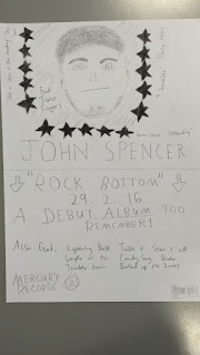
I came up with the idea for my magazine advert by looking at real life examples by actual music artists, belonging to both the indie genre and also other genres. For the indie artists magazines adverts I have seen, I analysed two, one being by Jake Bugg and the other being by Ed Sheeran. From doing this it enabled me to look at the conventions and elements which are within them, how they are used and to what effect this achieved, which gave me a greater insight into what I should include within my magazine advert. I created a plan for my magazine advert also, which I took inspiration from a number of different artists magazine adverts, although my planned design differs a bit to the final product, but contains the same/ similar elements but used to a different impact.

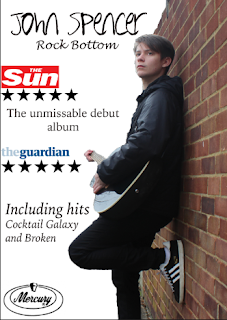
The colours within my magazine advert are conventional towards the indie genre, and help towards promoting my artist effectively. The magazine advert itself is black and white, which is a form of editing which is commonly seen throughout the indie genre. I have incorporated this specific element as it appeals towards the target audience (fans of the indie genre). This is as it is visually what they would expect to find within a magazine advert, through including it making it look similar to that of real life counter parts. Alongside this, fans of the indie genre are often mature and older than most other music audiences, and through having the black and white gradient adds towards the advert having a nostalgic feel towards it, which I have included to directly appeal towards them. The use of this element is also appealing towards promoting the my music artist, as it makes it clearly evident that the artist belongs to the indie genre and establishes that to people that might be unfamiliar with them. This helps towards promoting the artist as having his image being very indie like and providing with a retro element towards the magazine advert, which makes the artist come across in a more appealing way towards the niche target audience. Because of this it helps towards promoting the artists image directly towards the audience to ensure the album/ music videos success, of being appealing towards the intended target audience.

A connotation of the use of colours within my magazine advert is evident. This is because people that see it might get the impression that my group and I's music artist enjoys retro music, and that he creates music of that nature. This is appealing as the content within the indie genre having a retro feel towards it is appealing towards the target audience as it is a common convention, and visually what they would expect to find. Because of this it helps towards promoting my music artist as if the viewer sees the artist in this light they might find his image to be more appealing for them, and for this reason might entice them to buy their new album, or if not to watch the artists latest music video to get an idea of what content they create.

Conventions of the genre are present throughout my magazine advert. One example of this being a guitar and guitar case which can be seen within the advert. The use of this convention is appealing towards the target audience as it lets them know straight away that the artist belongs to the indie genre. Therefore the niche target audience of fans of the indie genre may take an interest in the artist straight from the off, as she is shown as representing the genre and providing with visuals which they will be familiar with. This helps towards promoting the artist as it makes it clearer to those that are not familiar with the artist that he creates indie content, and therefore the use of the conventions such as the guitar, black and white filter and other conventions are included to cater directly towards the target audience. All of this may lead towards the audience taking a liking towards the artist, and make him come across in a more favorable light. This might entice them to either purchase the artists album, or to at least view the artists content online via his music video.

I have used a large variety of images. One example of images which have significance towards the magazine advert are the star ratings, by various media outlets (one being by the sun magazine). This can be seen besides the artists image, and has a number of artist and target audience benefits towards it being there. Firstly, the target audience might find this appealing as it is made clear to them that the artist is highly regarded. This might make them more likely to show an interest in the artist, due to the amount of positive feedback by large media outlets. This is as if the audience feels as if the music artist produces/ creates high quality content from the high reviews, they are going to be more likely to look further into the artist. Including these images into my magazine advert is also effective towards promoting my artist as it clearly shows him in a positive light. This as the reviews rate him and his content highly, and in turn will make the target audience more likely to purchase his new album, or at the very least watch his music videos as they might feel as if they are missing out otherwise. This helps towards the overall success of the artist, as if they are the topic of debate between individuals either online or word of mouth, the general perception of the artist is going to be good, which will help towards making the artists image appealing towards a larger number of people; allowing for additional exposure and sales not only just from the niche target audience. This is as fans of music as a whole might take these comments on board and watch the artists music video, and take a liking towards him from being recommended. The more exposure given enables for a greater chance of higher album sales, the foundations of this coming from the positive words of large media publishers.

The layout and design of my magazine advert helps towards both promoting my artist, and appealing towards my target audience. An example of where this is evident can be seen with my placement of image of my artist, as it is directly in the middle of the frame. This is appealing for my target audience for a number of reasons. Firstly, this is as the artist is made the main center of attention, where he is shown having a direct mode of address towards the audience. Through having the direct mode of address as being the main focus, this enables for the viewer to create a relationship between the visuals of the artist, as the artist is shown to be directing himself towards the viewer. From this relationship being formed, it enables for the artist to come across in a more down to earth and generally more likable way, as the artist is shown to be a relatable character to the viewer. The layout of this image is effective towards promoting the artist as the artists image is clearer to see for the viewer, which enables for him to get more exposure as those that might be unfamiliar with how the artist looks will be able to associate an image with the name. If the viewer does create a relationship with the visuals due to the placement of the artist, this might entice the viewer to purchase the artists album or to view their music video, due to the "personal" connection evident between the viewer.

The typography use within my magazine advert is conventional to the indie genre. For the name of the artist, the font I chose to include looks very similar to a style of handwriting. This has been purposely put in to assist with both appealing towards the target audience and to promote my artist. This is appealing for my target audience as they might feel as if they have a more "personal" connection with the artist. Because of this it enables for a relationship to be built between the two. This is effective towards promoting the artist as it shows him as having a close bond with his fans and appreciating them. From this positive representation as well as the potential for a relationship to be built between the visuals, it increases the chance of higher album sales, and the overall reputation of the artist within the media to be better.

The use of language I have included within my magazine advert is both appealing towards my target audience and towards promoting my music artist. This is as evident through the text of "debut album to remember". This is appealing towards the target audience and promoting my artist in a number of ways. Firstly, its appealing for the target audience as it might entice them to take an interest in the artist, which might result in them either purchasing their album, or watching the artists music video. This is as the person who sees it might feel as if they are missing out otherwise due to the emphasis drawn on how its a good album. This is effective towards promoting the artist as it makes the artists portrayal come across in a better way. This is as the artist is shown in a good light to those that see it, so it might connote to the target audience that the music within the album is very good, due to it being unmissable. From this, including this use of language would generally help towards increasing the number of potential album sales, as well as making the artists image better for the media.

There are a few weaknesses I found when using Photoshop throughout this process. One issue I had was trying to crop the backgrounds out of certain images. This is as the software struggled to identify what within the image was what I wanted to keep, as when using the magic wand tool (even on a small and more precise setting) removing backgrounds was a bit of an issue as the final product would have imperfections. I overcame this issue by retaking certain pictures in different locations, so that this time round the image which I wanted to keep (which was my artist) stayed and the background was removed, which I found easier to do when finalizing the final product.

Although saying that, there were still a large number of strengths towards using the program. One aspect in particular which I liked was the large array of fonts (text tool) to choose from, ranging from a number of different styles and textures which could be used in a number of different ways. This feature I believe in particular helped towards making my magazine advert successful. This is as the fonts throughout my magazine advert had to differ from each other for certain effects, one example being the use of a handwriting like font with the name of the artist. This helped towards making the artist come across in a more down to earth and likable light, due to the "personal" feel created. Because of this it assisted towards the overall success of the magazine advert and the portrayal of my artists image, due to him coming across as being more likable and relatable.

I have taken a number of inspirations from my work which I applied towards my final product. One example of this can be seen with the image of my artist being placed directly in the middle of the frame, and being the main focus. I gathered inspiration from this with a magazine advert by the artist Calvin Harris. Although not related towards the indie genre, I took the idea of having the face of the artist to be the main focus of my magazine advert as it enables for the artists face to be "out there", and to become more recognizable within the media. From doing this, it enables for my artist to get more exposure, and in turn helps towards increasing album sales from the artist being a familiar face in the media.

I followed a number of elements which were within my originally intended design of my magazine advert, while in the process making a number of changes towards the layout. The use of images within my magazine advert doesn't differ too far away from what can be seen within my plan, although the way in which this shown towards the viewer has been altered. An example of this can be seen with the use of star ratings seen besides the artists face in my planned version. This was changed within my final version to not be placed besides all angles of the artist, but rather to have two reviews placed towards one side of the artist.

Conclusion 

I do feel that my advert does conform to genre conventions. This is as I have included a large variety throughout, which would be commonly seen within real life examples. Through doing this it will make my own magazine appeal more towards my target audience of fans of the indie genre, as my final product is what they would expect to see throughout real life examples.

For this reason I do believe that my magazine advert appeals towards my target audience. This is as mentioned previously it will look similar to that of real life examples through the use of conventions, overall making it look professional and appealing. Also, through the use of having an image of the artist to be the main focus, it allows the audience to gauge a better perspective of the artist, which through doing this may enable them to form a relationship with the visuals. This is as the audience is exposed to the artists facial expression and body language; therefore receiving a more "personal" insight into them, which might enable them to relate towards the artist and make come across in a more down to earth way.

I think that creating the magazine advert will help towards promoting my artist, both with their album and music video. This is as if someone who views the advert see's the artist as being someone they might enjoy listening to, they may preview a music video of theirs to see whether or not they like it. Leading on from this, through promoting the artist and music video, if the view does in fact enjoy the music video and artist, it might entice them to purchase their album. Both of which is achieved through giving the artists face and album name exposure, so if the viewer finds the artists representation to be appealing and relatable, it might lead them to look at the other media outlets of theirs shown within the magazine advert; being both the album and music video.
Final magazine advert

Upon receiving feedback from my target audience, I have made a number of amendments to my magazine advert to make it more appealing towards my audience.
One comment I received from my target audience was that they felt as if they didn't know what to look at as there were too many different colours and fonts on the magazine, so I have improved upon this by making the only font colour to be black, and to only use two different font types. I believe this has helped the visuals to look more crisp and clearer. The target audience would find it more appealing for that reason due to the higher quality visuals, and also due to the only colour font being black, it further re-enforces that the artist belongs to the indie genre, and that he represents the genre.


Monday, 16 November 2015

Planning Digipak - Miss Miller


Digipaks have a number of elements which differ from jewel CD cases, one of the most noticeable differences being that Digipak's often include more content than a jewel CD case. This is as digipaks have 6 sides of content for the audience to look at and read so there is a lot more artwork for the album, being different from just buying or purchasing the normal jewel CD case. Digipak's have a lot of significance to an artists image as it shows the artists audiences that they are cared about and that every individual has significance to the artist. It also shows that they have a lot more content to create and release towards their audiences because of the digipak additional content oppose to the standard jewel CD case. Digipaks also include extra songs as well as better picture quality compared to that of CD's. This encourages loyal fans to buy this digipak for the extra content provided by their favourite artist. 

I will be creating my own digipak for my group and I's created artist, in the aim of trying to make it appealing towards the target audience and to promote the artist. I will try to achieve this through the use of indie genre conventions throughout, shown by the use of various micro elements portraying macro meanings. Planning is very important towards creating an effective digipak. This is as doing prior planning I can get a better idea of what I am going to include when I go to create the actual thing, so that Im not going into the task not knowing what elements to have in it, and to what effect this will be done. 

There are a number of elements which are within my mock version of the digipak, the first being the use of colours. One example of this can be taken from the top right hand corner image, of the artist leaning beside a tree playing his guitar. The colours within the image are all very basic, the artist wearing full black. This shows the contrast in visuals between the artist and the rest of his surroundings, which makes the outfit of the artist standout further. This is effective as black is a common colour within the indie genre as it portrays the artist as being dull and plain. The target audience may find the contrast in colours appealing and the portrayal of the artist due to it relating towards the indie genre, and that fans of the artists are more than likely going to belong to the niche target audience, therefore providing with an artist portrayal which is what they would expect. This helps further promote the artist as it makes it clearer through the contrasting colours that he belongs within the indie genre of music. 

I have conformed to the conventions of the genre within my mock digipak. One clear example where this is evident within is with the middle right frame, where I have drawn a guitar in the middle of the frame. The presence of musical instruments, more specifically guitars are very conventional to the indie genre, often being associated with artists within advertisements, music videos and various other things. This is appealing for the target audience as it portrays the artist as clearly being an indie artist and belonging to the genre, which they may like as fans of the indie genre and artist like to associate him with his genre of music, making it clearly evident to others that he belongs to the indie genre of music. This helps promote the artist for this reason, as it lets people know straight away as soon as they look at the digipak that he belongs to the indie genre due to the presence of the guitar directly in the middle of the frame, being the only image there which draws more significance towards it. This makes people that might not be fans of the indie genre to know that the artist is indie and likes to show this to others, to draw in more fans from within that genre. For this reason I have converted to have various genre conventions present throughout to assist towards creating an indie like image for the artist, and to make the visuals more appealing to fans of the genre, providing with visuals which they will be used to seeing, helping towards making my artists digipak look similar to that of real life counterparts. This wouldn't differ too much from a jewel CD case as indie artists would probably have some sort of musical instrument within it also, but having it on the digipak helps towards emphasising the presence of these conventions. 

I have included a various number of images within my mock digipak, one in particular being seen at the top right hand corner of the digipak, the front cover of the digipak showing the artists dull and worried facial expression which is shown through a direct mode of address. This is effective towards promoting the image as the artists face has been made to be the main focus of the visuals on the front page, allowing for his face to get more exposure to a larger number of people. The use of this image within my digipak is also appeals towards our target audience as through the facial expressions of the artist being highlighted, alongside the artist showing a direct mode of address might make the viewer feel as if they are getting a closer and more personal  insight towards the artist as an individual. Through this, the viewer may be able to create a relationship between the artist, due to the front cover making the artist come across as if he is addressing just the person seeing it.  

The design/ layout of my mock digipak helps towards promoting my artist and making it appealing towards the target audience. One example which I have drawn to try and achieve this is evident with the two middle frames, one being of the guitar and the other being the personal message of the artist. Both items are placed in the middle of the digipak, and are the first things seen when first viewing it, because of this I have included two important elements towards appealing towards the target audience and promoting the artist, with the attention of drawing even more attention towards them. Drawing more attention towards the use of the iconography of the guitar helps towards promoting the artist as it makes it clear towards people that are unfamiliar with the artist that he does in fact belong to the indie genre of music , and creates that type of music, drawing in fans of that niche target audience. Having the personal message in the middle is appealing towards the target audience as it is directed to the viewer, making it easier for the viewer to be able to build a relationship with the artist through making the personal message clearer. 

The typography has a lot of significance towards the name of the artist on the front and back cover of the digipak. This is as for the artists name, it is done in a handwriting like font, and can be seen within the mock digipak. The use of this is effective towards appealing towards promoting the artist as it makes the artist come across as being someone who appreciates his fans, and that he has a close bond with them through the personal touch of the use of handwriting as the artists name. This is appealing for the target audience as they might feel as if they have a more personal bond between the artist. and that they are being given a more personal portrayal of the artist throughout the images of the digipak. Through this connection, the viewer is more likely to build a relationship with the artist through including elements such as this, it might make them feel as if the artist is addressing them and only them, providing with a "personal" touch. 

The use of language throughout my digipak has importance, the most noticeable form of this being evident within the personal message of the artist, as it is a long written message. An example from within the text written is "I really appreciate the continued support". This helps towards further promoting the artist as it shows the artist in a positive light, making any new potential fans potentially like him through his appreciation of his fans. This could potentially result in the artist getting a larger fan base, ultimately leading towards more sales of additional content such as digipaks. This is appealing for the target audience as it demonstrates how the artist and the viewer have a relationship, and that every individual fan is appreciated. This creates a generally likable image as it shows him giving back credit to those that help him progress throughout, which the viewer may appreciate as the artist is shown in a down to earth light which the viewer may be able to relate towards; oppose to a big named star who shows no appreciation to there fans.